Click below to view previous blogs:
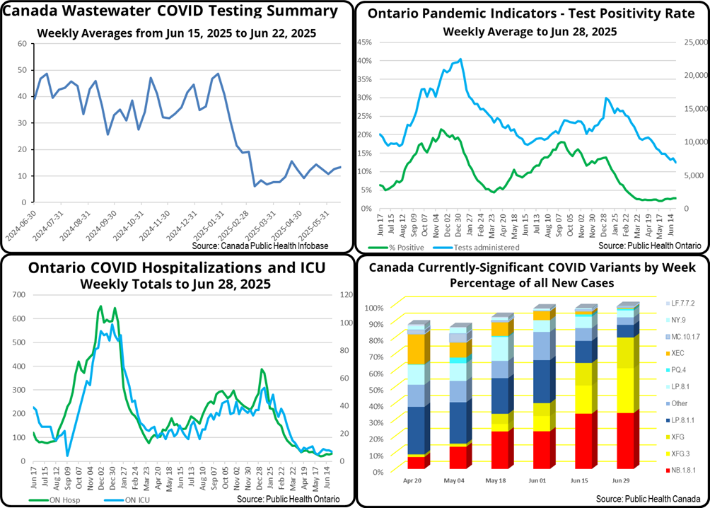
Once again, this most recent composite chart shows that both Canada-wide and Ontario rates of new COVID infections are continuing to rise very gradually from their seasonal lows of mid-May, which were less than half last year’s earlier (mid-March) lows.
For Ontario, the rate of positive PCR test results has increased moderately from 2.1% in mid-May to 2.8% in late June. Over that same period, Ontario COVID hospitalizations increased from 27 to 33 and ICU bed occupancy from 5 to 7. Those numbers are all dramatically lower than last year at the same time.
After a month of no updates, the more independent statisticians at COVID-19 Resources Canada estimate the number of Ontarians currently infected and therefore infectious as one in 118 people. I find this statistic more useful than the traditional ones for guiding how cautious I should be in indoor public spaces.
The week’s viral market share graph in our composite chart is again based on Public Health Canada data because it is both more up-to-date and more relevant to Canada than the equivalent from the US Centers for Disease Control. With Canadians travelling less frequently to the USA and more internationally, Canadian COVID infection trends now tend to be more globally influenced and lead rather than follow those of the US. What is striking about this week’s graph is the sheer speed at which the new XFG.3 recombinant variant is growing its share of new infections. It remains in second place at 27% but, with its XFG parent in third place at 19%, together they account for 46% of new cases, well above NB.1.8.1 which is only notionally dominant at 34%. That may be a good thing in that, while there is no significant difference among the currently-circulating variants with respect to overall severity of infection, NB.1.8.1 has been associated with quite painful “razor blade” sore throats.
